In this article, I will walk you through my journey of migrating a React single-page application (SPA) from Bootstrap to Tailwind CSS in one of my projects at work.
I will discuss the pros and cons of the architectural strategies our team has considered during the migration. Then, I will move to the execution of the picked strategy and share some learned lessons throughout the whole experience.
After reading this article, you will learn:
- the importance of a good research
- different architectural strategies with their pros and cons for migrating from one UI framework to another
- how to make trade-offs when making a decision
- actionable steps for migrating from Bootstrap to Tailwind CSS
- best practices like Dependency Isolation, Atomic Design, etc.
Step 0: Starting point
A single-page app (SPA) created with Create React App (CRA) and the following packages:
Step 1: Research phase
Before tackling a problem or proceeding with an architectural decision, it’s a good practice to spend some time planning, researching, and developing in a time-boxed manner. This will increase the chances of getting the most suitable decision for your case.
So, after some ideation, we came up with four strategies/options to migrate from Bootstrap to Tailwind CSS. We evaluated each by listing the positive and negative sides and creating a quick SPIKE for a broader view of the potential pitfalls.
💡 Look before you leap.
 Image Credits: Unsplash.
Strategy 1: Complete rewrite of the app
from Bootstrap to Tailwind CSS.
Pros (➕):
- nice, sweet, and clean - We won't have any dirty stuff and workarounds by rebuilding the project from scratch.
Cons (➖):
- time & $$$ - It will cost a lot of time and money to rebuild the project using the new UI library.
- no value for the end customers - We won’t be able to implement new features and deliver any customer value for some time.
Strategy 2: Update Bootstrap’s variables and theme
to resonate with Tailwind CSS’s default theme and continue developing new features with Tailwind CSS. For more info, check this section in the previous article.
Pros (➕):
- customer value - We can deliver customer value and features while integrating and using the two frameworks.
- save time and $$$ (maybe) - Instead of completely rewriting the app, we can integrate and use both libraries incrementally. We will waste considerable time and money if we have the bugs mentioned in the cons section.
Cons (➖):
- class and style mismatches - We might end up having classes with the same names from the two libraries leading to unexpected styles and making it hard to debug.
- hard to update the theme - There are just too many things to cover and there’s always the risk of missing something.
- significant risk for potential issues - The risk for future problems and hard debugging is enormous.
- hard to replace Bootstrap later - By mixing both libraries in our components and pages, it will become complicated to remove Bootstrap after that because everything will be coupled → spaghetti code 🍝.
Strategy 3: Create a Component Library
based on our Design Language System (DLS) with Tailwind CSS and use it throughout the different client’s projects, starting from the current one.
Pros (➕):
- Design Language System ready to be used throughout the different projects and products - A DLS will be a huge benefit, so we can have the same look and feel throughout the different customer product lines.
- nice, sweet, and clean - We will have a clean code. Everything will be decoupled and properly configured.
Cons (➖):
- time and $$$ to develop and integrate
- no value for the end customers
Strategy 4: Integrate Tailwind CSS
and use it together with Bootstrap.
Pros (➕):
- customer value
- save time and $$$
- remove Bootstrap later - By rightly integrating Tailwind CSS, we can lay the foundations for later removing Bootstrap with ease.
- prepare for the DLS - By creating reusable and atomic React components styled with Tailwind CSS, we can easily move them into a separate UI library later.
Cons (➖):
- class and style mismatches
- messy and ugly
- anti-pattern - That’s an anti-pattern because we will use two completely different libraries for the same thing (styling) in the same project.
In the end, we decided to go with Strategy 4. We can start using Tailwind CSS, update the pages step by step, and simultaneously deliver new features to the end customers so we don’t stop providing customer value.
Step 2: Isolate react-bootstrap
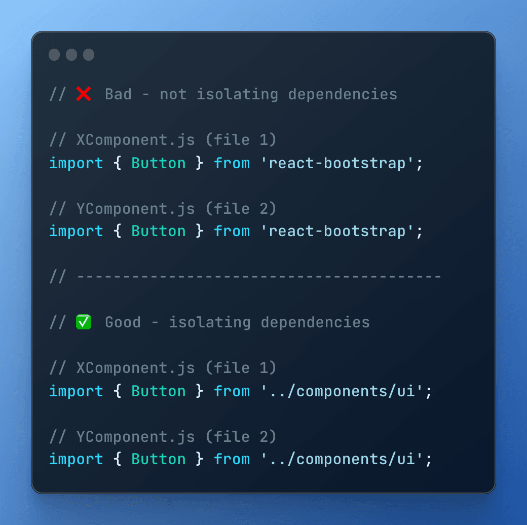
Before starting the implementation, we revisited how we use react-bootstrap in the project. We saw we reference it throughout the whole codebase. And this was another anti-pattern we had in our project.
By isolating react-bootstrap in our codebase, we can later replace one component from the package with our implementation. We can do that without updating the files where we use the component.
Consider the following example:

When isolating the Button component, we can replace its implementation in ../components/ui/Button.js with our custom one. We will update only one file. Later, we can substitute react-bootstrap without introducing significant changes in the project.
Yet, we must update all files that reference import { Button } from 'react-bootstrap';. That's very risky and there's an enormous potential of breaking something.
That's why we moved all react-bootstrap's components into one place.
💡 Isolate dependencies.
Step 3: Integrate Tailwind CSS
We followed the tailwindcss installation guide to install and configure it in our project.
But, we did two crucial changes in our configuration:
- We turned off the
preflightmode to disable the default styling coming from Tailwind CSS. - We added a custom
ms-prefixto all Tailwind CSS classes, so we don’t have any collisions with the Bootstrap ones.
This enabled us to use classes both from Bootstrap and Tailwind CSS at the same time without interference. For example:
<span className="mt-2 ms-px-2 ms-text-amber-300 ms-border">
  {`Hello World!`}
</span>
Step 4: Rewrite components when possible
In steps 2 and 3, we’ve isolated react-bootstrap components into a single place and we've configured Tailwind CSS. Next, we sought opportunities to extract reusable React components styled with Tailwind CSS.
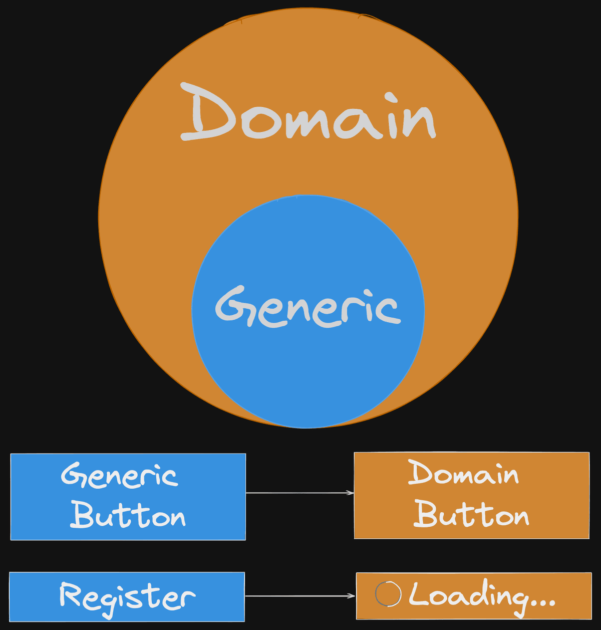
Since we will be creating new React components, we decided to split them into two categories:
- Generic Components styled with Tailwind CSS. Our goal was to prepare for creating a Reusable React Component UI Library, which we can use throughout our client's projects in the future.
- Domain Components tailored to our Domain and used throughout the pages in the current web application.
To better illustrate the idea, consider the image bellow:

In this example, we can have a Generic Button component and a LoadingButton as a Domain component.
💡 A key principle we followed was Atomic Design, where we’re not designing pages; we’re designing systems of components.
Also, we didn’t change the components’ APIs. We followed the ones from react-bootstrap because we didn’t want to introduce many changes at once, only style updates.
One key aspect of this step was using twin.macro to have tailwindcss classes in our styled-components.
This is how we rewrote react-bootstrap's Badge component to use Tailwind CSS and keep the same API.
import React, { forwardRef } from 'react';
import PropTypes from 'prop-types';
import cx from 'classnames';
import styled from '@emotion/styled/macro';
import tw from 'twin.macro';

const StyledBadge = styled('span')`
    ${tw`ms-px-2 ms-py-1 ms-inline-flex ... ...`}

    &.primary {
        ${tw`ms-bg-primary-100 ms-text-primary-500`}
    }

		...

    &.pill {
        ${tw`ms-rounded-full`}
    }

    &.xs {
        ${tw`ms-text-xs`}
    }

    ...
`;

const Badge = forwardRef(
  ({ className, as, variant, size, pill, ...props }, ref) => (
    <StyledBadge
      {...props}
      ref={ref}
      className={cx('ms-badge', className, variant, size, {
        pill,
      })}
      as={as}
    />
  ),
);

Badge.propTypes = {
  className: PropTypes.string,
  pill: PropTypes.bool,
  variant: PropTypes.string,
  size: PropTypes.string,
  as: PropTypes.elementType,
};

Badge.defaultProps = {
  className: '',
  pill: false,
  variant: 'primary',
  size: undefined,
  as: 'span',
};

export default Badge;
In the end, our Folder Structure looked like this:
/src
│   ...
|   ...
│   AppRoutes.js
│
└───components         --> reusable Domain Components used throughout the Pages
│   │   Header.js
│   │   ...
│   └───ui             --> Generic Components (preparing for UI lib)
│       │   index.js
│       │   Button.js
|       |   Badge.js
│       │   ...
└───pages              --> actual Pages on our web app
│   │   ...
│   └───login
│       │   index.js
│       │   ...
└───...
│
└───...
Conclusion
💡 There’s no silver bullet for every problem or situation. That’s why good exploration sets the path to success. In the end, it’s all about tradeoffs.
In addition, there’re several things I like to point out:
- Strive for incremental improvements. Rome is not built in 1 day. Neither is your “perfect” application, so having some “bad code” is okay.
- Be careful about anti-patterns and code smells. Try to avoid them in advance.
💡 Sometimes you can accept having an anti-pattern in your codebase but you should be very aware of why you have it and at what cost.
🔔 If you liked my blog post, follow me on LinkedIn, where I share coding tips daily. Hope to see you there.